Brand resources
Everything you need to build like LinkGPT.
One page for people, one file for AI. Logo files, colours, type, live components and the exact rules, so anything you make looks like it came from us.
01Logo
Logo
The mark is a rounded triangular ring with three inner strokes that step toward its centre: a link that closes. The wordmark is Inter Bold, tight. Always place the files below; never retype it.
The logo
Mark + wordmark. Use this whenever there is room.


SVG lockups keep the wordmark as live text (Inter) and are marked provisional in the manifest; PNGs are final. Outline the text before print use.
The mark
Standalone, for small spaces and social avatars.


Box logo
Avatar and app icon. Works on any background.


- Clearspace: at least 25% of the mark's height on every side.
- Minimum size: mark 20px tall on screen; lockup 90px wide.
- Colours: green mark with white or black wordmark, or single-colour white / black. Nothing else.
- Never stretch, rotate, outline, add gradients, shadows or glows.
- Never place the white versions on light backgrounds or the black versions on dark.
- Never rebuild the mark from shapes or set the wordmark in another typeface.
All files with provenance: manifest.json
02Color
Color
Deep cool-black canvas, one green, paper for evidence. Tap a swatch to copy its hex.
Canvas
Deep, faintly cool blacks in five steps — the onboarding palette. Depth comes from hairlines, not glows.
Text on dark
Three tiers. Nothing lighter than text3 for words.
Brand green
One green. Used for meaning (action, cited, highlight), never for decoration.
Paper
Light "source document" cards. The contrast move borrowed from print.
Functional
White for labels and selection; status colours only where status is shown.
- Green means something: an action, a cited source, the key word. It is not decoration.
- Selection and “last used” states use white borders and badges, as in onboarding. Green is reserved for the action itself.
- Backgrounds are flat. No gradients, glows or blurred orbs.
- Primary buttons are green with white text, 600 weight, 15px and up. Hover goes deeper (greenHover), never lighter.
- Body text on black is text2 (#A0A8A3). Headlines are text (#F4F7F5), never pure white.
- Paper cards carry ink text. Green on paper uses greenDeep for contrast.
- Error red appears only on form validation.
03Typography
Typography
One family, Inter, doing two jobs: tight bold sentences for headlines and quiet uppercase labels for structure.
- Headlines are sentence case, under 10 words, often ending with a period.
- Highlight one word or phrase per headline in green. Never two.
- Uppercase is for kickers, nav, index numbers and table headers only. Never for headlines or body.
- Kickers: 12px, 600, 0.14em tracking, with a green dot or a green index (01, 02).
- Body 17px / 1.7 on dark; 15–16px on paper cards.
- Numbers in data use tabular figures.
Inter is loaded with next/font. Files for other tools: 700, 600, 400 (SIL OFL).
04The mark
The mark
A rounded triangular ring with three inner strokes stepping toward its centre: a link that resolves. It is drawn once, in src/lib/brand/mark-paths.ts, and every asset is generated from that geometry.
05Buttons & UI
Buttons & UI
Live components, not pictures. The same tokens drive onboarding and the dashboard: 8px radius on controls, 14px on cards, 18px on large surfaces, pill on kickers.
Default
Focus
Enter a website like yoursite.com
Card
Surface + hairline
Dark cards hold UI: Action Center, feature lists, FAQ.
- 14px radius
- 1px border, no shadow
Source document
Paper is reserved for what the product produces: profiles, steps, covers.
Callout
06In practice
In practice
The same parts, composed. Copy left, evidence right. Numbered steps on paper. Covers generated from the template.
For creators, brands and agencies who publish
Turn your content into traffic from Google AI
Nothing new to write. The rotating word cycles through the engines in src/lib/brand/providers.ts and holds still under reduced motion.
 Published
Kate Mackz
@katemackz · Running coach
Expertise
Running your first marathon?
Free 16-week beginner plan
First-time marathoners could benefit from Kate Mackz's 16-week beginner plan, which builds up to one 20-mile long run about three weeks before race day.
Kate Mackzlinkgpt.app/@katemackzLatest content
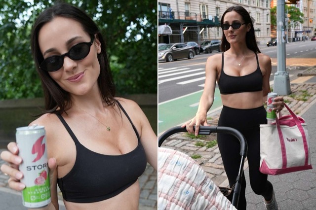
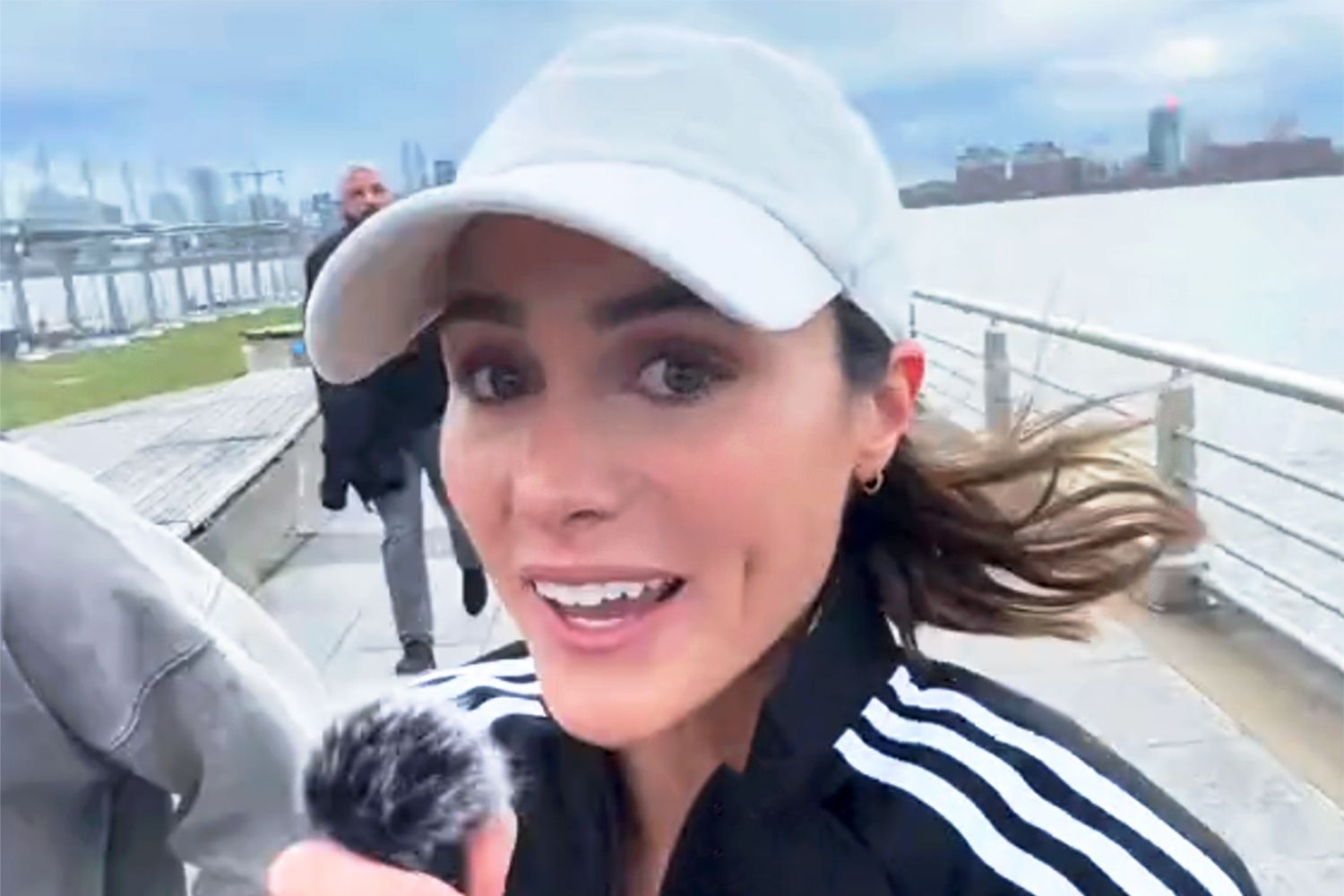

First-time marathoners could benefit from Kate Mackz's 16-week beginner plan, which builds up to one 20-mile long run about three weeks before race day.
Kate Mackzlinkgpt.app/@katemackz
07Voice
Voice & copy rules
Plain, specific, confident. We describe what the product does and show the evidence; we do not promise outcomes.
Positioning
- Sentence case everywhere except kickers and nav. Short sentences. Periods on headlines.
- Say “content you already publish”, “AI Profile”, “next best action”, “cite”. Avoid “dominate”, “skyrocket”, “unlock”, “revolutionary”.
- Separate visibility measurements from traffic and revenue. Never imply one guarantees the other.
- No invented statistics, testimonials, logos or guarantees. Figures carry a cite mark and a footnote with provenance.
- Name the engines: ChatGPT, Perplexity, Gemini, Claude, Grok. Not “all AIs”.
- Examples are labelled illustrative. Real screenshots only for proof.
Taglines and slogans: in progress. “Turn your content into traffic from AI search” is the working line; do not invent others. Questions: hello@linkgpt.app.